- 首页
- International
- 艾特奖
- 文化节
- 服务体系
-
网站导航
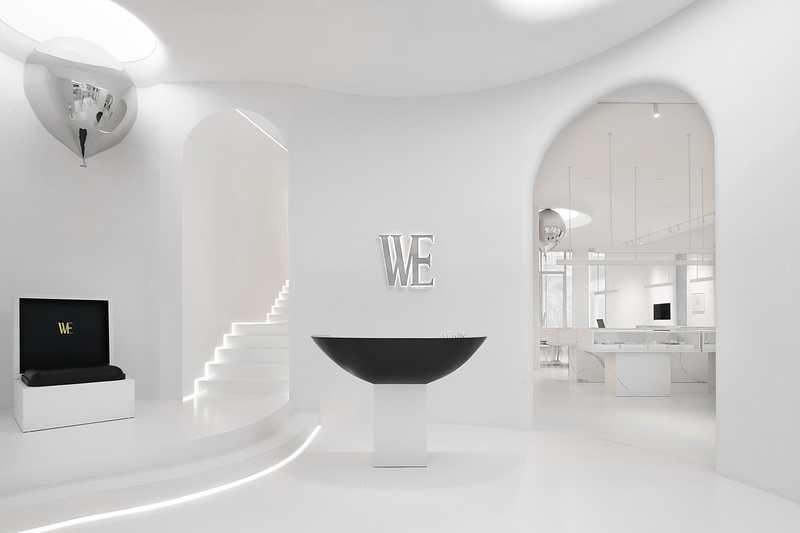
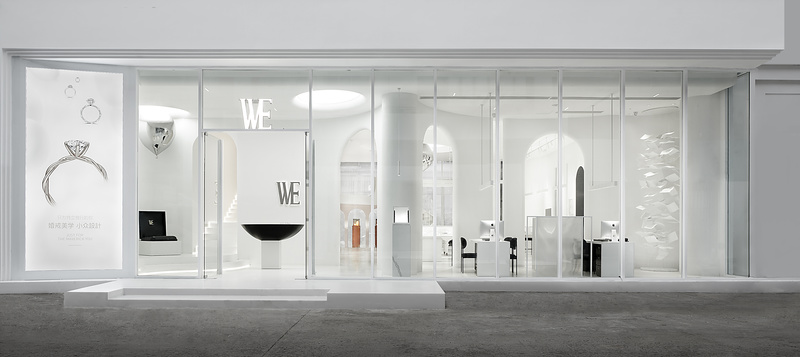
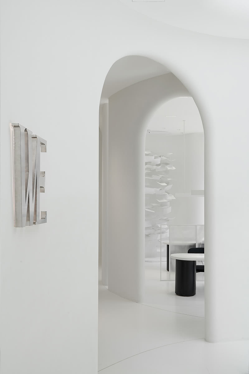
光是建筑最高级的表达方式之一,空间利用光与建筑产生交融,外部我们采用通透的玻璃幕墙结构,形成一个向外的展示空间,同时也形成了通透感,引入更多的光。内部做了一些曲面形的建筑构造体,来作为一个前后区的空间区隔,形成一个内建筑体。形态语汇中的弧形与光的灵感相结合,形成了空间整体构造,同时这面构造体可以把一些自然光遮挡起来,自然光通过拱洞投射进来,形成空间的光影对比。同时我们再顶部上方,也用了一些异形拱洞的设计,模拟天光,营造光源穿透顶面的感觉。
空间融合的首要是统一空间形态语汇,我们应用圆,拱形,曲线等作为的设计语言,在空间中寻求表达。设计中我希望空间与人要能产生互动关联,通过设计引导产生关联,所以空间中我们也融入一些其他装置来烘托空间的氛围。它正好位于空间的入口处,无论是消费者或是是路人,都可以引导至此,做一个网红打卡,形成人与空间的互动,同时也可以通过互联网传播,以达到品牌的曝光度与识别度。
Light is one of the most advanced expressions of architecture. The space USES light to blend with the building. We adopt transparent glass curtain wall structure to form an external exhibition space, and also form a sense of transparency to introduce more light. Inside, some curved building structures were made to act as a spatial partition between the front and rear areas, forming an internal building body. The arc in the morphological vocabulary is combined with the inspiration of light to form the overall structure of the space. At the same time, the structure on this side can keep out some natural light, which is projected through the arch hole to form the contrast of light and shadow in the space. At the same time, on top of the roof, we also used some special-shaped arch hole design to simulate sky light, creating the feeling of light source penetrating the top surface. The primary purpose of spatial integration is to unify the spatial morphological vocabulary. We use circles, arches and curves as the design language to seek expression in the space. In the design, I hope that the space and people can have interactive relation, which can be generated through the guidance of design, so we also integrate some other devices into the space to highlight the atmosphere of the space. It is located at the entrance of the space. No matter consumers or passersby, they can be guided to make a web celebrity clock to form the interaction between people and the space. At the same time, it can also be spread through the Internet to achieve the exposure and recognition of the brand.

01

02

03